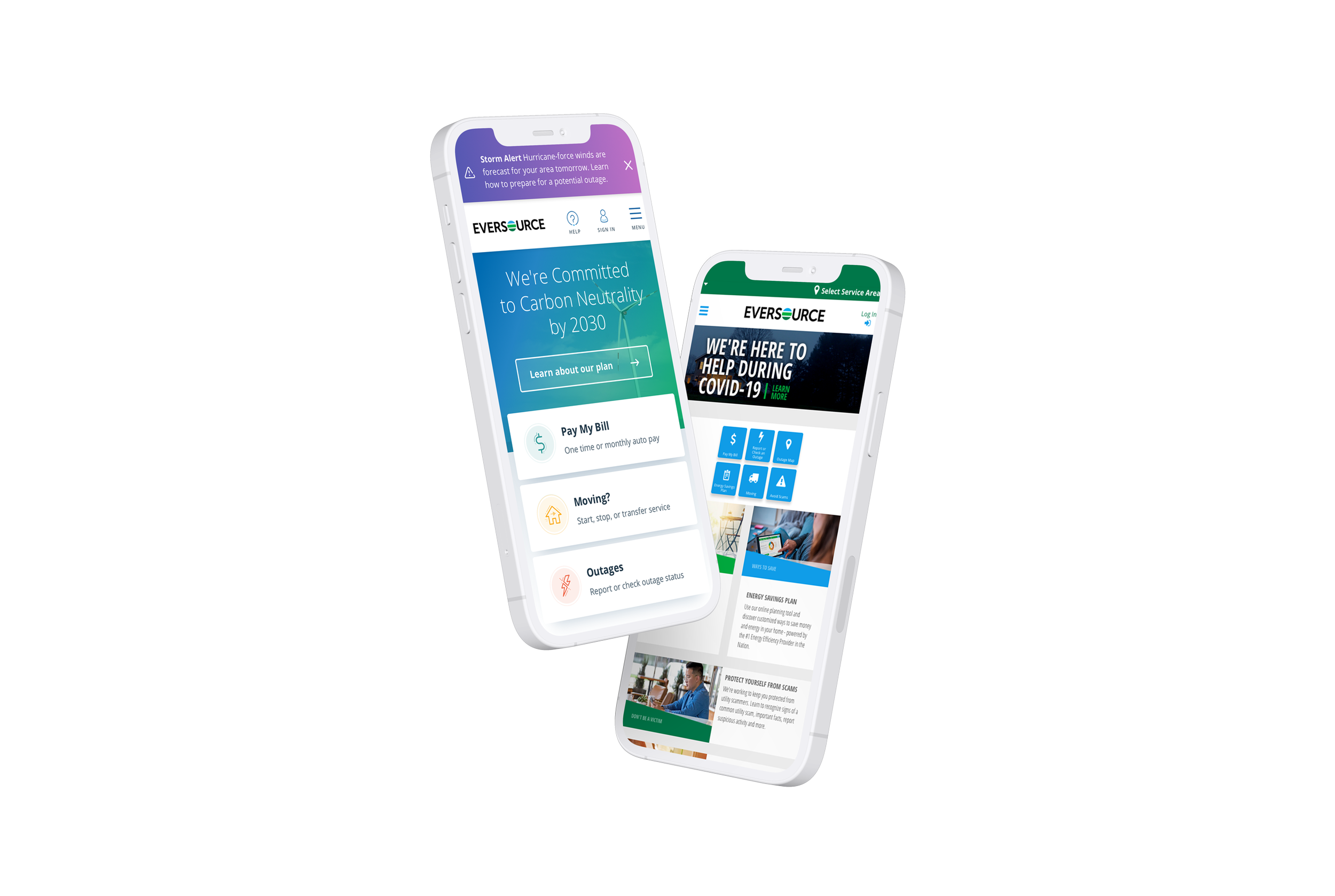
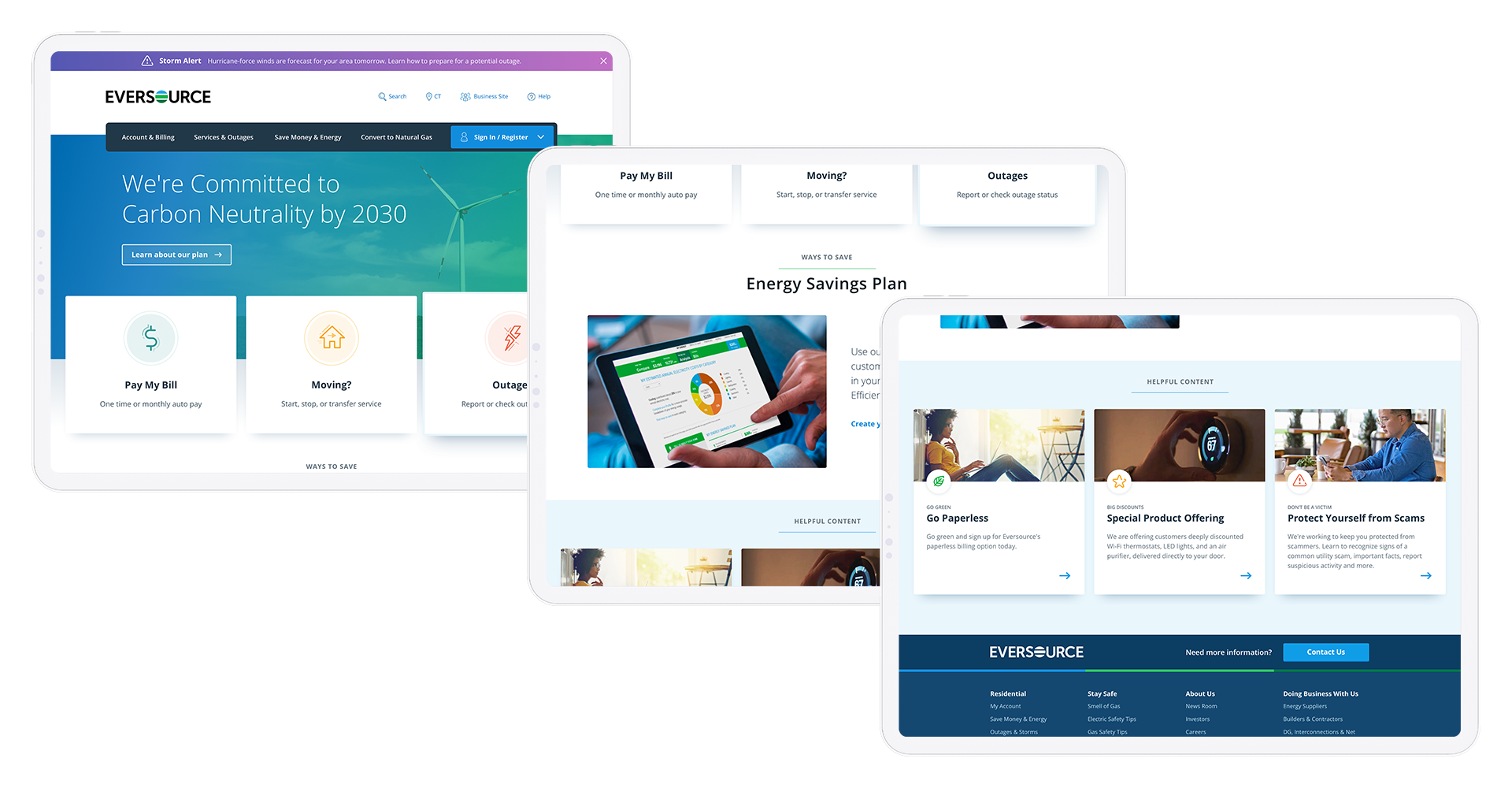
Eversource Homepage:
Bluesky Redesign
What would a utility company like Eversource look like on the web, if not constrained by current technical hurdles or aging design patterns? Could it be easily navigable on mobile devices? Could it inspire and help improve customer perception?
Informed by Data. Build the Vision.
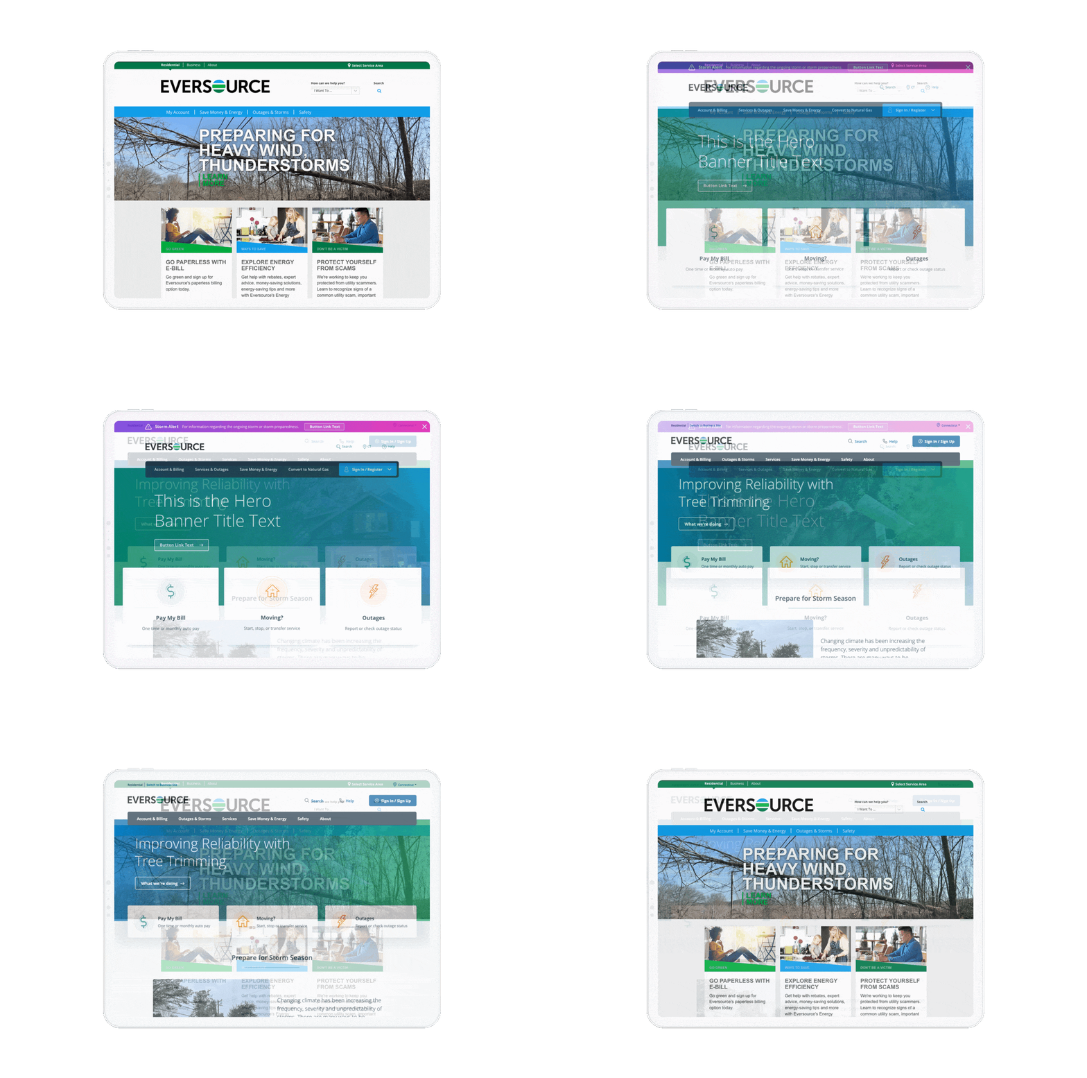
It was learned through research and analytics (surveys), that the current state of the Eversource homepage was difficult to use due to legibility issues and poor contrast. Feedback including words like ‘anxiety, difficult, complex’ were focused in on to inform the visual direction for the bluesky design. Combining with this focus on customer sentiment, was the ambitious goals of the organization at what a sustainable future could look like, with Eversource at the forefront.
The Eversource core brand colors, an array of blues and greens, enabled the creation of a gradient overlay. This was a modern evolution of color to be reusable on various collateral, and a step in the direction toward being both sustainably-focused and approachable.
“Color is a power which directly influences the soul.”
— Kandinsky
With the continuous and very real threat of climate change, Eversource and its customer base are exposed to sever weather and the consequences that mother nature can impart on the electrical grid and transmission services.
With the primary Eversource brand colors being a family of blues and greens, it was paramount to explore and introduce a color to cut through the cohesiveness that existed when messages of safety and time-sensitive information needed to be provided.
That being said, I took inspiration from the color system that the National Oceanic and Atmospheric Administration uses to display severity in an attempt to borrow from patterns customers are familiar with when watching meteorologists on local news.


With over 4 million customers, the opportunity and responsibility to implement significant design changes was not taken lightly. The ability to power one’s home, appliances, and medical devices is a delicate matter and one that is emotionally charged when disruption occurs.
The above designs were tested via moderated studies conducted by Bob Thomas, a phenomenal user researcher and educator. Further UX guidance and collaboration was provided by Kalindi Arabis, Pat Higgins, Ketan Galhotra, data insights by Richard Boulanger and Jane Ansara, and additional design support and collaboration with Matt Neil.
The bluesky direction was significantly favored over the direction of the legacy website, and was viewed as being ‘open, modern, and friendly’. It is what led to the current live website viewable today.


